Friday, November 19, 2010
Tuesday, November 16, 2010
Tuesday, November 9, 2010
Project 4- Prepare GIS and Transportation
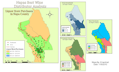
What do you observe about the geographic distribution of households and their restaurant, liquor store, and wine purchases in Napa County?
Going by the maps it shows that normally areas with a larger total of households produce more wine purchases, than those areas that don't have as many homes.
What do you observe about the distribution of liquor stores and restaurants relative to these purchasing patterns?
Basically the same answer as the first question, areas with more households contain higher sales at restaurants and liquor stores.
Monday, November 1, 2010
Project 3- Report GIS and Economic Development
Project 3 GIS and Economic Development
This is my report of Project 3. No real issues on this project, everything was straightforward and didnt take a lot of time to finish. On to Project 4!
This is my report of Project 3. No real issues on this project, everything was straightforward and didnt take a lot of time to finish. On to Project 4!
Monday, October 25, 2010
Project 3- Analysis GIS and Economic Development
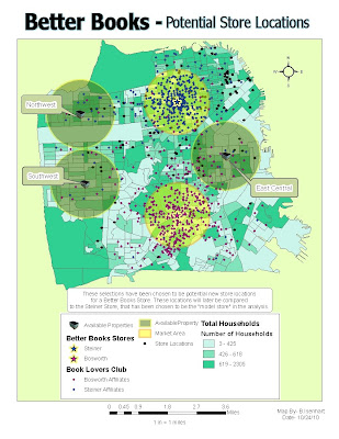
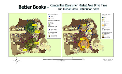
The maps above are my deliverables for Project 3 Analysis week. The first map displays available locations for a new Better Books Store. The map also states that the Steiner store will be used as the model store. The second map compares drive time vs. household buying patterns for the current Better Books Stores.
Tuesday, October 12, 2010
Project 3- Prepare GIS and Economic Development
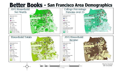
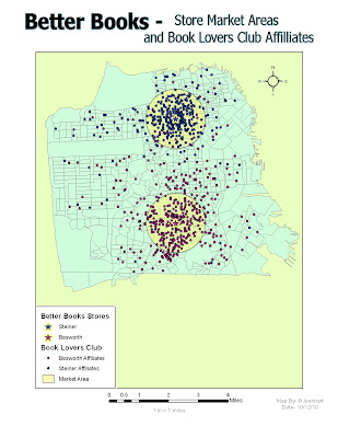
These are my maps that I created for Project 3 Prepare week. The first map displays 4 seperate Demographic Maps showing Avg Household Net Worth,College Percentages, Household Totals, and AVG Household Income. Included in all four maps are locations of Better Books Locations and Competitor Locations. The second map shows both store locations with a 1mile buffer surrounding it, also included in this map are Book Lovers Club locations and they are color coated to what store each club is affiliated to. This week was a breeze to complete and it felt good to be able to finish within a couple hours.
Monday, October 11, 2010
Project 2- Report GIS and Landscape Design
Project 2 Report Power Point
This my report for Project 2. Everything went well the first two weeks, and last week I had a couple hiccups on what numbers I had to use for the DBH table but other than that it went pretty smooth. Two projects downn three more to go!
This my report for Project 2. Everything went well the first two weeks, and last week I had a couple hiccups on what numbers I had to use for the DBH table but other than that it went pretty smooth. Two projects downn three more to go!
Monday, October 4, 2010
Project 2- Analyze GIS Landscape and Design
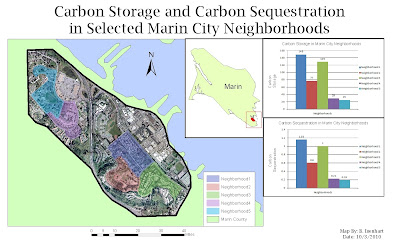
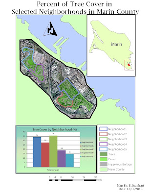
These are two maps that I created for the Project 2 Analyze Week. The first map contains information calculated to show the total Carbon Storage and Carbon Sequestration of selected neighborhoods in Marin County. And the second map contains information presenting a map and graph of total tree cover in the same selected neighborhoods.
Monday, September 27, 2010
Project 2 Prepare- GIS and Landscape Design
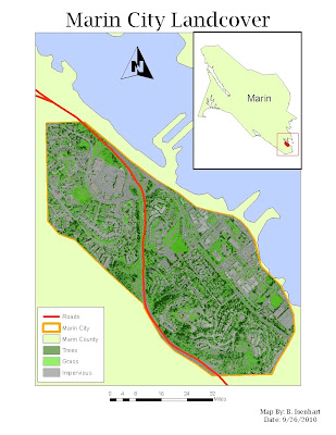
Land Cover Classification MetaData
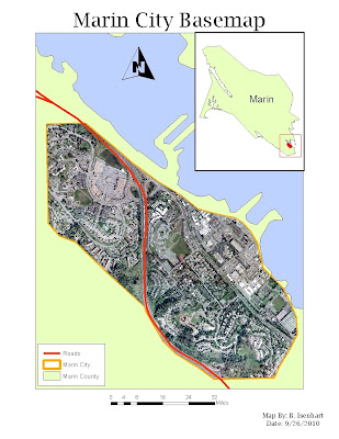
This is my map for the Prepare Week of the Landscape Design Project. This map shows zoomed in portion of Marin County Directly over Marin City. The map contains the county border, city border, an Orthoimage of the city, and any major roads that run through Marin City. The second map contains all the same components but I substituted my orthoimage with my classification image. Looking forward to Week 2, looks to be an interesting project
Monday, September 20, 2010
Project 1 Council Presentation Map
Part 3 Section 3
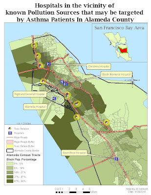
In Part 3 Section 3 we studied and analyzed information provided by Census Tracts to find the most populated tracts by the Black ethnic group. We also took a look at Toxic Release Points and Hospitals in proximity of those populated areas. This map pretty much is an overall view of the information that was studied and put together to find the areas most affected by Asthma and also the most probable Hospitals that could be targeted by these Asthma related problems.
Part 3 Section 2
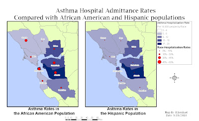
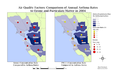
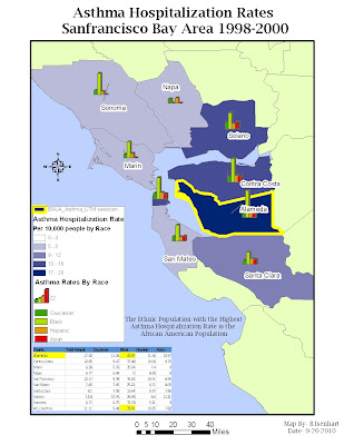
In Part 3 Section 2 we studied and analyzed the Annual Asthma Rates in the San Francisco Bay Area by race and also compared those rates with other Air Quality factors. In map 1, it displays the annual asthma rates of the Hispanic and the African American ethnic groups, clearly showing that ashtma is a more popular health problem with the African American race than the Hispanics. In map 2, it displays the comparison of the annaul asthma hospitalization rates along with air quality factors such as ozone and particulate matter. And lastly in map 3 pretty much sums up the final results of the analysis of which race seemed to experience the most asthma related problems. And referencing back to map 1, it shows that Alameda County had the most cases of this health issue in African Americans. Included also in the map is a chart of the avg asthma rates.
Part 3 Section 1
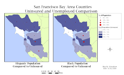
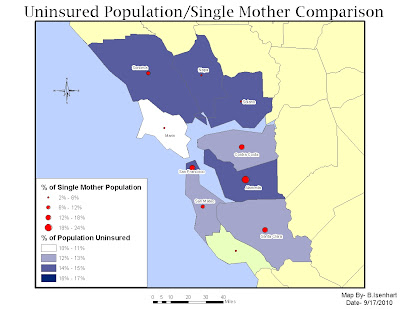
In Part 3-Section 1 of the Public Health Analysis of the San Francisco Bay area in California, we studied and compared the Unemployment and Uninsured Rates of different ethnic groups. In the first map it shows the comparison of these different rates with the particular races, and in the second map it shows the same comparison but the only change is instead of comparing unemployeed and uninsured, I compared uninsured rates with the single mom population.
Wednesday, September 15, 2010
Project 1 Analyze- GIS and Public Health
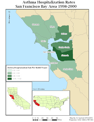
This is a cloropleth map of the Asthma Hospitalization Rates in the San Francisco Bay Area between 1998 and 2000. This project is intended to analyze the effects of Asthma and other inhalation issues, to help local hospitals project the need for more help and amount of supplies that may be needed in the future.
Tuesday, September 7, 2010
Tuesday, July 27, 2010
Module 5: LiDAR and Filtering Challenge
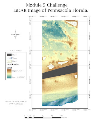
This is my map submission for the Module 5 LiDAR Challenge. The map image is a overhead photo of Pennsacola,Fl created using ArcGIS and LiDAR Technology. I some small issues while doing this challenge. First was trying to get the points to show up correctly after I had modified the column headings. And the other issue was that I forgot to change one fo the default settings from X to Z and it was making my raster show up as straight up and down colors instead of allowing it to look like an actual photo of something.
Sunday, July 18, 2010
Module 4: Image Classification Challenge
Image Classification Lab Challenge
This is my map submission of the Module 4 Image Classification Lab Challenge. I didn't really have any issues with ERDAS this week. I was hoping the colors in my map were what they needed to be, I've seen a couple of other maps that look similar to mine so I think I'm on the right track.
This is my map submission of the Module 4 Image Classification Lab Challenge. I didn't really have any issues with ERDAS this week. I was hoping the colors in my map were what they needed to be, I've seen a couple of other maps that look similar to mine so I think I'm on the right track.
Monday, July 12, 2010
Module 3- Rectification
Challenge 3
This is my map submission of the Module 3 Challenge, which is a Rectified Map of Pennsacola, Fl. This took me a couple trys due to the constant freezing of the program and having to start over and do it again. Other than the program being sluggish, the concepts that we are doing are pretty cool.
This is my map submission of the Module 3 Challenge, which is a Rectified Map of Pennsacola, Fl. This took me a couple trys due to the constant freezing of the program and having to start over and do it again. Other than the program being sluggish, the concepts that we are doing are pretty cool.
Sunday, July 4, 2010
Module 2- Remote Sensing Science
Challenge 2- Map 1
Challenge 2- Map 2
Challenge 2- Map 3
These are my map submissions for the Spectral Characteristics Challenge. I'm still trying to get a good idea about how the new software works and also get a grip on all the band information and all other new concepts that I've been introduced to the past couple weeks. But hopefully within the next couple weeks before the class ends I'll have a much better understanding of it all.
Tuesday, June 29, 2010
Module 1 Challenge
Module 1 Challenge
This is a map of my very first map using ERDAS. It is just a basic map familiarizing me with the basics of making a final map with a north arrow, scale and a title.
This is a map of my very first map using ERDAS. It is just a basic map familiarizing me with the basics of making a final map with a north arrow, scale and a title.
Sunday, April 25, 2010
Monday, April 5, 2010
Module 11- Google Earth
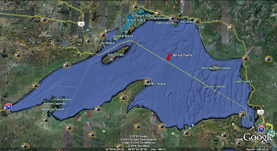
This is my potential Wind Farm, located in Lake Superior. This area is secluded and far away from any neighborhoods or businesses, which will help with any problems caused by "eye sores", Shadow Flicker, or Ice Throw. The area has significant wind speed to be able to turn the large wind turbines. Also being where it is, it is out of the path of any major bird migration routes.
Saturday, March 27, 2010
Module 10- Isopleth Map
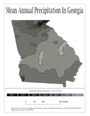
This is a Isopleth Map of the Mean Annual Precipitation in the state of Georgia. I really liked this lab, it was not real difficult and pretty much straight forward. I used the live paint tool in AI to fill in the different areas, then used the pencil tool with a white background to cut the edges around the state.
Friday, March 19, 2010
Module 9- Flow Map
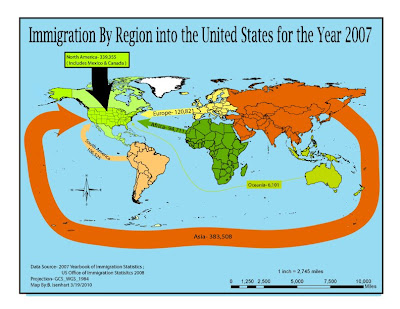
This is a map of the Immigration of People from regions around the world into the United States in the year 2007. I thought I was beginning to get the hang of AI, but after the break we had I think I may have forgotten a little bit about it. I mostly just had problems with the layers, theres so many different trees in some of the maps I get lost trying to find the particular layer I'm trying to modify or make it be the top-most layer.
Sunday, March 7, 2010
Module 8: Dot Map
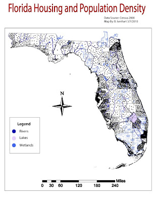 This is a Dot map of the housing and population density of Florida in 2000. This was a very time consuming lab and I'm very happy to be finished with it. It wasn't a hard lab to complete, but making all the dots really kind of slowed it down. I think it turned out well, I didnt really have any issues with doing anything. I'm really having fun learning how to do these maps in both classes.
Tuesday, March 2, 2010
Module 7: Proportional Symbol Maps
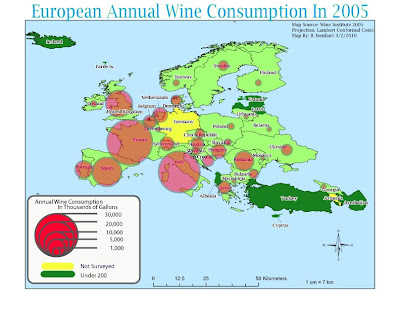 This map is a Proportional Symbols Map showing the Annual Wine Consumption on Europe in 2005. This lab was a little time consuming at first, but after getting the formuals down and entered into Excel things went pretty fast. Making the symbols didn't take as long as I thought it would but other than not being sure how to start off, this lab eneded up being pretty fun and simple. I feel like my map is well balanced and I also tried to pick colors that would show up well with eachother such as the man land areas underneath the red circles.
Sunday, February 21, 2010
US Regional Population Map # 2
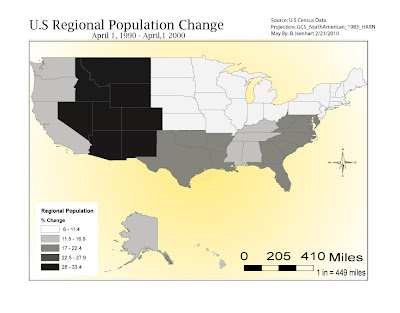 This is a map of the Population Changes by Region in the US between April1, 1990- April1, 2000. The hardest part of this part of the lab was putting together each regions state populations then figuring out the % for the whole region and then making the Equal Interval Classification. I did what I felt was the correct formuals and the map turned out fairly well. Also, I feel like I'm becoming a little more familiar with the Adobe software.
US State Population Map #1
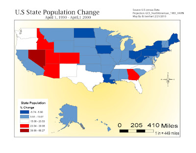 This map of the US State Population % Change from April 1.1990- April1, 2000. It took alittle bit to get things moved around after I transferred my map from ArcMap. I'm still trying to figure out the layers section of AI, just seems to me there's a lot of different features and sometimes I click on the wrong line and I move something I don't nesscessairly want to move. Other than that I'm learning and having fun doing it.
Saturday, February 13, 2010
Map Composition Lab
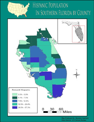 In this lab it took me a little while to figure out how things could be laid out to look the best. It is fun because you have so many possibilities to make changes and to change the way the whole map looks like. Having another lab with Adobe kind of let me become more familiar with the tools, but there is still a lot more to be learned. I spent a good bit of time moving things around, trying to determine different colors for the counties, and also trying to use the tools that was mentioned in the videos provided by Mrs.Holtzclaw.
Sunday, February 7, 2010
Module 4:Typography Lab
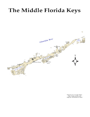 This was a totally new experience for me. I have never delt with this Adobe software. It turned out being kind of fun after I felt my way around alittle bit and finding all the tools that I needed to use, and also how they worked. The videos provided by Mrs.Holtzclaw made it somewhat easier after watching them and seeing the various tools that were used in the examples. All in all it was a useful lab and look forward to learning more about the Adobe software.
Saturday, January 30, 2010
Quantile Map
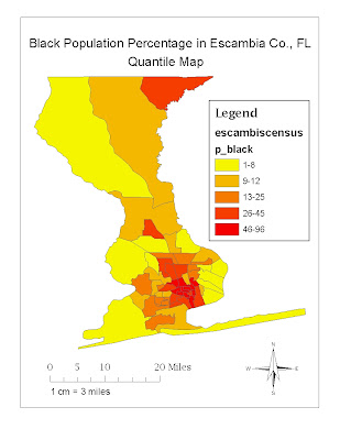 In this map I used the automated values given to me for the different classes. I like this map because it provides more detail of the different percentages in each area without having to create more classes. I shyed away from the Equal Interval map because it does have an easier legend to go by but you may have to create more classes to make it more appealing, for myself at least, to see a little more detail of every individual area instead of having one color cover majority of the map.
Data Classification Lab
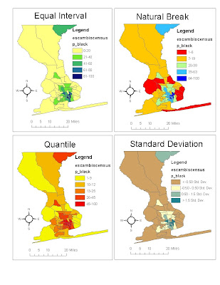
Personally I like the Quantile and the Natural Break in this particular situation,because they seem to cover a little more detail unlike the Equal Interval. Seems to me that Equal Interval legend is easy to understand but in this case it doesn't give you a lot of color in the map, unlike the others which give a little more range that allows more detail in the map rather than having the whole map almost 3/4 of one color. Also, I don't really like the Standard Deviation because it's legend may be hard to understand especially if you are new to that certain classification.
Sunday, January 17, 2010
Good Map Deliverable
Bad Map Deliverable
Tuesday, January 5, 2010
Ready To Start!
Tomorrow starts my first day of GIS Certification. I'm excited and a little nervous at the same time on feeling out how the whole online thing will go since I'm totally new to it. So I'll hope for the best try and get all I can out of the whole experience!
Subscribe to:
Comments (Atom)


