 This is a map of the Population Changes by Region in the US between April1, 1990- April1, 2000. The hardest part of this part of the lab was putting together each regions state populations then figuring out the % for the whole region and then making the Equal Interval Classification. I did what I felt was the correct formuals and the map turned out fairly well. Also, I feel like I'm becoming a little more familiar with the Adobe software.
Sunday, February 21, 2010
US Regional Population Map # 2
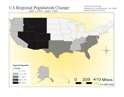
 This is a map of the Population Changes by Region in the US between April1, 1990- April1, 2000. The hardest part of this part of the lab was putting together each regions state populations then figuring out the % for the whole region and then making the Equal Interval Classification. I did what I felt was the correct formuals and the map turned out fairly well. Also, I feel like I'm becoming a little more familiar with the Adobe software.
Subscribe to:
Post Comments (Atom)

Good effort Brandon. Try to reserve blue for water (in the first map). Also, I would suggest using a common size for fonts. The scale bar size is a bit distracting.
ReplyDelete