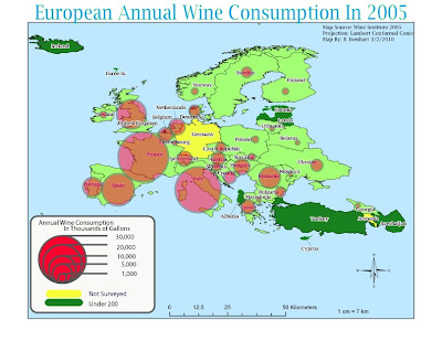
 This map is a Proportional Symbols Map showing the Annual Wine Consumption on Europe in 2005. This lab was a little time consuming at first, but after getting the formuals down and entered into Excel things went pretty fast. Making the symbols didn't take as long as I thought it would but other than not being sure how to start off, this lab eneded up being pretty fun and simple. I feel like my map is well balanced and I also tried to pick colors that would show up well with eachother such as the man land areas underneath the red circles.
Tuesday, March 2, 2010
Module 7: Proportional Symbol Maps
 This map is a Proportional Symbols Map showing the Annual Wine Consumption on Europe in 2005. This lab was a little time consuming at first, but after getting the formuals down and entered into Excel things went pretty fast. Making the symbols didn't take as long as I thought it would but other than not being sure how to start off, this lab eneded up being pretty fun and simple. I feel like my map is well balanced and I also tried to pick colors that would show up well with eachother such as the man land areas underneath the red circles.
Subscribe to:
Post Comments (Atom)

Very nice! I really like your spin on the legend...it's refreshing.
ReplyDelete