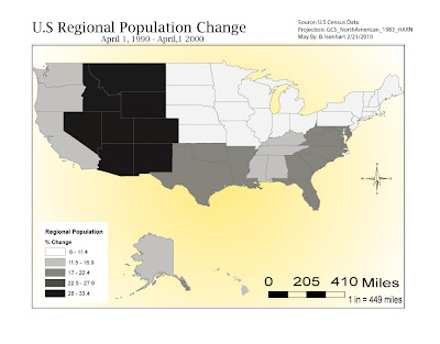
 This is a map of the Population Changes by Region in the US between April1, 1990- April1, 2000. The hardest part of this part of the lab was putting together each regions state populations then figuring out the % for the whole region and then making the Equal Interval Classification. I did what I felt was the correct formuals and the map turned out fairly well. Also, I feel like I'm becoming a little more familiar with the Adobe software.
Sunday, February 21, 2010
US Regional Population Map # 2
 This is a map of the Population Changes by Region in the US between April1, 1990- April1, 2000. The hardest part of this part of the lab was putting together each regions state populations then figuring out the % for the whole region and then making the Equal Interval Classification. I did what I felt was the correct formuals and the map turned out fairly well. Also, I feel like I'm becoming a little more familiar with the Adobe software.
US State Population Map #1
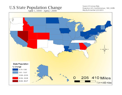 This map of the US State Population % Change from April 1.1990- April1, 2000. It took alittle bit to get things moved around after I transferred my map from ArcMap. I'm still trying to figure out the layers section of AI, just seems to me there's a lot of different features and sometimes I click on the wrong line and I move something I don't nesscessairly want to move. Other than that I'm learning and having fun doing it.
Saturday, February 13, 2010
Map Composition Lab
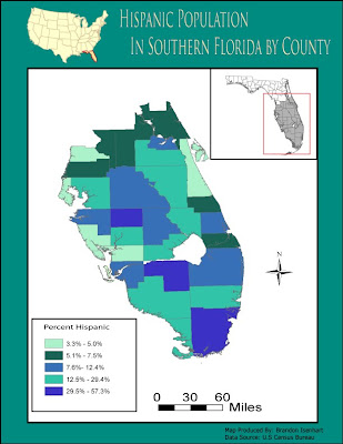 In this lab it took me a little while to figure out how things could be laid out to look the best. It is fun because you have so many possibilities to make changes and to change the way the whole map looks like. Having another lab with Adobe kind of let me become more familiar with the tools, but there is still a lot more to be learned. I spent a good bit of time moving things around, trying to determine different colors for the counties, and also trying to use the tools that was mentioned in the videos provided by Mrs.Holtzclaw.
Sunday, February 7, 2010
Module 4:Typography Lab
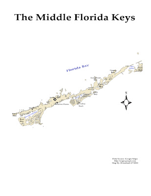 This was a totally new experience for me. I have never delt with this Adobe software. It turned out being kind of fun after I felt my way around alittle bit and finding all the tools that I needed to use, and also how they worked. The videos provided by Mrs.Holtzclaw made it somewhat easier after watching them and seeing the various tools that were used in the examples. All in all it was a useful lab and look forward to learning more about the Adobe software.
Subscribe to:
Comments (Atom)
