Monday, September 27, 2010

Project 2 Prepare- GIS and Landscape Design


Land Cover Classification MetaData

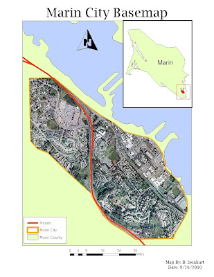
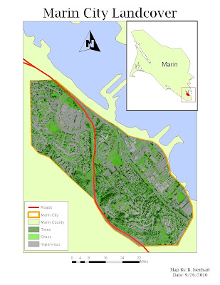
This is my map for the Prepare Week of the Landscape Design Project. This map shows zoomed in portion of Marin County Directly over Marin City. The map contains the county border, city border, an Orthoimage of the city, and any major roads that run through Marin City. The second map contains all the same components but I substituted my orthoimage with my classification image. Looking forward to Week 2, looks to be an interesting project

Monday, September 20, 2010

Project 1 Council Presentation Map


This is the map I would use to present at the next council meeting. It pretty much shows other maps that I've created but minus some extras that were not needed to show the base results of the analysis.

Part 3 Section 3


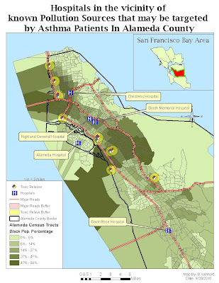
In Part 3 Section 3 we studied and analyzed information provided by Census Tracts to find the most populated tracts by the Black ethnic group. We also took a look at Toxic Release Points and Hospitals in proximity of those populated areas. This map pretty much is an overall view of the information that was studied and put together to find the areas most affected by Asthma and also the most probable Hospitals that could be targeted by these Asthma related problems.

Part 3 Section 2


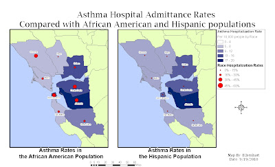
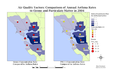
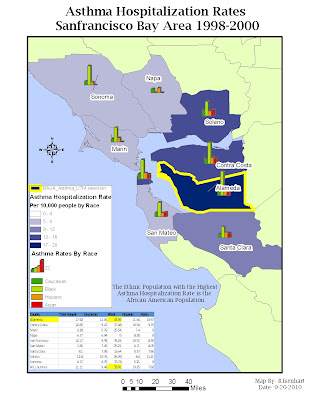
In Part 3 Section 2 we studied and analyzed the Annual Asthma Rates in the San Francisco Bay Area by race and also compared those rates with other Air Quality factors. In map 1, it displays the annual asthma rates of the Hispanic and the African American ethnic groups, clearly showing that ashtma is a more popular health problem with the African American race than the Hispanics. In map 2, it displays the comparison of the annaul asthma hospitalization rates along with air quality factors such as ozone and particulate matter. And lastly in map 3 pretty much sums up the final results of the analysis of which race seemed to experience the most asthma related problems. And referencing back to map 1, it shows that Alameda County had the most cases of this health issue in African Americans. Included also in the map is a chart of the avg asthma rates.

Part 3 Section 1


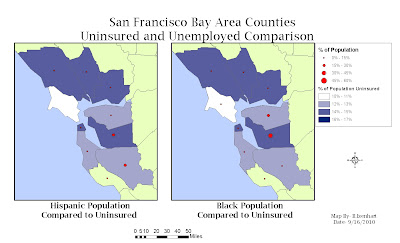
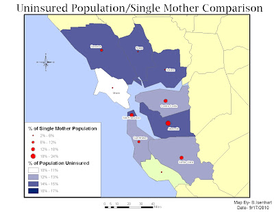
In Part 3-Section 1 of the Public Health Analysis of the San Francisco Bay area in California, we studied and compared the Unemployment and Uninsured Rates of different ethnic groups. In the first map it shows the comparison of these different rates with the particular races, and in the second map it shows the same comparison but the only change is instead of comparing unemployeed and uninsured, I compared uninsured rates with the single mom population.

Wednesday, September 15, 2010

Project 1 Analyze- GIS and Public Health


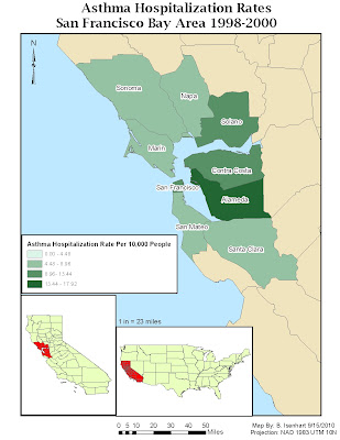
This is a cloropleth map of the Asthma Hospitalization Rates in the San Francisco Bay Area between 1998 and 2000. This project is intended to analyze the effects of Asthma and other inhalation issues, to help local hospitals project the need for more help and amount of supplies that may be needed in the future.